We love looking at cool logos and, like many designers, use other people’s excellent work to inspire us. A while back we posted some of our sample logo designs using letter shapes and I got to thinking we should do a whole alphabet of cool logos by others. That’s how I came up with this list of logo designs by other artists for some pretty well known companies and brands. Keep in mind as you view these that the list is totally subjective and is based on appeal to us. Anyway, let’s kick it off in order.
The Letter A – Anheuser-Busch
A clean, classic look with a distinctly American feel. Plus they make good beer.
The Letter B – Buffalo Sabres
This is an alternate logo from a few years ago. The simple but rugged look was a perfect fit for hockey.
The Letter C – Chick-Fil-A
The logo is pretty sleek and simple but visually interesting. Very cool how they worked the chicken into the letter C.
The Letter D – DoubleTree Hotels
A minimalist logo with very clean, classic lines. Well balanced and just as good in any color.
The Letter E – Internet Explorer
Not a fan of the browser but you can’t argue that the logo design is instantly recognizable all around the world.
The Letter F – Atlanta Falcons
Give me a mean looking bird of prey in the shape of an F. Done and done.
The Letter G – Gatorade
This logo pretty much defines the letter G. Really clean and very flexible allowing them to use it creatively.
The Letter H – History Channel
Amazing how they managed to make a simple letter H look bookish and historic but they got it done.
The Letter I – Iowa Hawkeye Wrestling
I told you at the beginning this thing was subjective so here is a shameless plug for my Hawkeyes. Tough looking bird, though.
The Letter J – Jiffy Lube
This is their old logo which is a lot better than their new logo. They worked a J an L and speedy service all into one little image. Nicely done!
The Letter K – Kodak
They’ve updated this logo periodically but have managed to keep the classic lines among the most recognized in the world.
The Letter L – Lexus
I won’t say the Japanese auto makers are the most creative as it seems they follow similar formulas for logo design. This one manages to appear rich and elegant in a minimalist way.
The Letter M – McDonalds
Another timeless classic that is recognized anywhere in the world and usually from about ten miles down the interstate.
The Letter N – Nebraska Cornhuskers
N was a tough letter but it’s hard to go wrong with Nebraska. Even without the word Huskers in this modern version any fan of college sports would recognize this bold red N.
The Letter O – Oregon Tilth
This logo says green, healthy and natural which is a good feel to project from an organic certification body.
The Letter P – Philadelphia Flyers
Amazing job of working a P, flying and a puck into a fairly simple overall design.
The Letter R – Russell Athletic
Not a lot of R logos out there with the staying power this one has had. It hasn’t changed a lot in over 100 years and still has the same proudly American feel it always had.
The Letter S – Superman
I know this is a bit of a stretch but I couldn’t find anything to beat it. A powerful design that has withstood the test of time with very little change.
The Letter T – Toyota Logo
The crest at the top looks a bit phallic but it took a little vision to make a T out of those three ovals. Like the Lexus logo earlier the design is elegant in it’s simplicity.
The Letter U – United Airlines
I included their old logo rather than the abomination that is their new logo. This bold design is very distinct and made the letter U say an awful lot.
The Letter V – Valvoline
Has some similar elements that made the United logo so good. Their packaging jumps off the shelf at you with this prominent design.
The Letter W – Hartford Whalers
This could have just as easily been in H with their creative use of negative space but the W with the whale tail on top landed it here. Very simple but creative design that will stay fresh forever.
The Letter X – X Box
Really slick modern design that appeals to a youthful franchise. The bold, contrasting colors and unique font make it very distinct.
The Letter Y – YMCA
They recently updated this logo and the new one grows on you. It has a softer appeal that is modern without being too trendy ands seems to work equally well in many different color combinations.
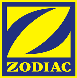
The Letter Z – Zodiac Inflatables
For many years Zodiac has been a leader in durable inflatable watercraft. Their logo is pretty durable as well and the strong, simple design makes it easily recognizable on their products.
Well, there you have it. Our alphabet of cool logos. We’d love to hear any suggestions you have for alternatives for any of our letters. We struggled with a few of them and I’m sure we missed some good ones. For example, I nearly put Budweiser for B but couldn’t let the same company have the first two 🙂 Anyway, enjoy them, discuss them or criticize them as you see fit.
2 Comments
This is the right blog for anybody who wishes to find out
about this topic. You know a whole lot its almost hard
to argue with you (not that I personally would want to…HaHa).
You certainly put a fresh spin on a topic which has been discussed for
ages. Great stuff, just excellent!
July 1st, 2013 at 8:49 am
Hello, i think that i saw you visited my website so i came to “return the
favor”.I am attempting to find things to enhance my website!I suppose
its ok to use a few of your ideas!!
April 15th, 2014 at 1:17 am