We put together a post a while back featuring an alphabet of famous letter logo designs and it became one of our most popular posts so we thought we’d take a look at famous logos featuring numbers. Surprisingly, it was pretty hard to find good, famous logos featuring numbers as a primary component of the design. We found a number of small, local companies using numbers but we wanted to stay with well known brands. Anyway, here are some of the better ones we came up with.
The Number 1 – Harley-Davidson
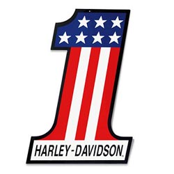
This #1 logo features a flag motif with stars and stripes for a classic, American look. This is one of their many logos over the years and a perfect example for this classic American brand.
The Number 3 – PlayStation 3
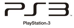
Less is definitely more for this simple PlayStation 3 logo. It doesn’t have much color or graphic variation but has a distinct font with a very edgy, modern look.
The Number 5 – HTML 5
![]()
The logo is pretty simple but modern and visually interesting. It’s also design related so we couldn’t leave it out.
The Number 6 – Motel 6
![]()
This is a new logo for 2012. It’s still pretty simple but we considered it a modest improvement over the traditional logo.
The Number 7 – 7-11
![]()
Their name also includes the number 11 but the 7 is the main numeric element. This one has stood the test of time is very well known around the world.
The Number 7 – 7-Up
![]()
Just like their slogan from a few years back, this logo is crisp and clean and is also one that is pretty well known throughout the world.
The Number 007 – James Bond
![]()
This logo was an instant classic when it came out and has been a staple of the movie series since. The simple elegance has made it easy to modify slightly as the films and the characters have become progressively modernized over the years.
The Number 8 – Super 8
![]()
We weren’t really looking for another budget hotel chain logo but this one jumped out at us. This one is also recently upgraded for a cleaner, more modern look.
The Number 11 – Big 10 Conference
![]()
This logo includes very interesting use of negative space to highlight the number 11. This is because, until very recently, the Big 10 actually included 11 schools. It’s now 12 with the addition of Nebraska.
The Number 21 – Century 21
![]()
The number 21 is clearly an important element but we like the house line art the best. This logo is also very flexible and easy to localize for individual broker offices so suits their needs very well.
The Number 45 – Colt 45 Malt Liquor
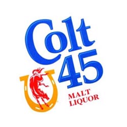
This brand is clearly past its prime but we still like the retro cool look and feel. There’s a lot going on with this one in terms of color and font but they still managed to pull it off.
The Number 64 – Miller 64
![]()
They re-branded this one just recently and, in our opinion, the new logo is a vast improvement. The new logo makes better use of color and features the distinctive Miller script.
The Number 76 – Philadelphia 76ers
![]()
Here’s another one using red, white and blue and stars to present a distinctly American feel. This logo has been around a while and still holds up pretty well.
The Number 76 – Union 76
![]()
This logo has been around a long time but has been periodically tweaked to clean it up and modernize it. It’s still very recognizable and a very nice combination of color and balance.
The Number 360 – X Box 360
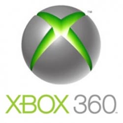
X Box made our collection of Letter Logo Designs and they’re in again with the X Box 360 logo. This one features the same combination of futuristic font and edgy colors and effects.
There’s Gotta Be More
This isn’t a bad collection but we know there have to be a bunch we missed. If you can think of any, give us logos and links in the comment sections below. If you want to comment on the designs we’ll included it in an update, too!